
What are the key principles of UI/UX design for SaaS applications?

User Interface (UI) and User Experience (UX) design are critical components in the success of Software as a Service (SaaS) applications. As SaaS platforms often cater to diverse users with varying needs, the design must prioritize clarity, efficiency, and accessibility. Key principles of UI/UX design for SaaS applications include simplicity, consistency, and responsiveness, ensuring seamless navigation across devices. Intuitive layouts, clear calls-to-action, and user-centric workflows enhance usability, while visual hierarchy and branding elements foster trust and engagement. By balancing functionality with aesthetics, designers can create SaaS applications that not only meet user expectations but also drive adoption and long-term satisfaction.
What are the key principles of UI/UX design for SaaS applications?
1. User-Centered Design
User-centered design is the cornerstone of effective UI/UX design for SaaS applications. This principle emphasizes understanding the needs, behaviors, and pain points of the end-users. By conducting user research, creating personas, and mapping user journeys, designers can ensure that the application is intuitive and meets user expectations. A user-centered approach also involves iterative testing and feedback loops to refine the design continuously.
| Key Aspect | Description |
|---|---|
| User Research | Gathering insights about user needs and behaviors. |
| Personas | Creating fictional characters representing user types. |
| User Journeys | Mapping out the steps users take to achieve their goals. |
2. Consistency and Familiarity
Consistency in design ensures that users can predict how the application will behave, which reduces the learning curve. This includes maintaining consistent visual elements, such as colors, fonts, and button styles, as well as consistent interaction patterns. Familiarity, on the other hand, involves leveraging common design patterns and conventions that users are already accustomed to, making the application feel intuitive from the start.
| Key Aspect | Description |
|---|---|
| Visual Consistency | Using uniform colors, fonts, and styles throughout the app. |
| Interaction Patterns | Ensuring similar actions yield similar results across the app. |
| Common Conventions | Adopting widely recognized design patterns and layouts. |
3. Simplicity and Clarity
Simplicity in UI/UX design means eliminating unnecessary elements and focusing on what is essential. This principle helps users achieve their goals without confusion or frustration. Clarity involves using clear and concise language, straightforward navigation, and visual hierarchy to guide users through the application. By reducing cognitive load, users can interact with the SaaS application more efficiently.
| Key Aspect | Description |
|---|---|
| Minimalism | Removing unnecessary elements to focus on core functionality. |
| Clear Language | Using simple and direct text to communicate with users. |
| Visual Hierarchy | Organizing elements to guide users' attention effectively. |
4. Accessibility and Inclusivity
Designing for accessibility ensures that the SaaS application is usable by people with diverse abilities, including those with disabilities. This involves adhering to accessibility standards such as WCAG (Web Content Accessibility Guidelines) and incorporating features like keyboard navigation, screen reader compatibility, and sufficient color contrast. Inclusivity extends this principle by considering the needs of users from different cultural, linguistic, and technological backgrounds.
| Key Aspect | Description |
|---|---|
| WCAG Compliance | Following guidelines to make the app accessible to all users. |
| Keyboard Navigation | Ensuring the app can be used without a mouse. |
| Color Contrast | Using colors that are distinguishable for users with visual impairments. |
5. Performance and Responsiveness
Performance is a critical aspect of UI/UX design, as slow-loading or unresponsive applications can frustrate users and lead to abandonment. Optimizing the application for speed and ensuring it performs well across different devices and screen sizes is essential. Responsiveness involves designing the application to adapt seamlessly to various devices, from desktops to mobile phones, providing a consistent experience regardless of the platform.
| Key Aspect | Description |
|---|---|
| Speed Optimization | Reducing load times to enhance user satisfaction. |
| Cross-Device Compatibility | Ensuring the app works well on all devices and screen sizes. |
| Adaptive Design | Creating layouts that adjust to different screen resolutions. |
What is SaaS in UI/UX design?

What is SaaS in UI/UX Design?
SaaS (Software as a Service) in UI/UX design refers to cloud-based applications that are accessed via the internet, where the user interface (UI) and user experience (UX) play a critical role in ensuring usability, accessibility, and satisfaction. SaaS products rely heavily on intuitive and visually appealing designs to attract and retain users, as they often operate on subscription models. The UI/UX design for SaaS focuses on creating seamless interactions, reducing friction, and enhancing productivity for users across various devices and platforms.
Key Characteristics of SaaS UI/UX Design
The design of SaaS applications is unique due to their cloud-based nature and subscription models. Below are the key characteristics:
- Scalability: The design must accommodate growing user bases and evolving features without compromising performance.
- Accessibility: SaaS applications must be accessible across devices, including desktops, tablets, and mobile phones.
- User-Centric: The design prioritizes user needs, ensuring intuitive navigation and minimal learning curves.
- Consistency: A consistent design language is maintained across all platforms to provide a unified experience.
- Performance: Fast loading times and smooth interactions are critical to retaining users.
Importance of UI/UX in SaaS Applications
UI/UX design is crucial for SaaS applications because it directly impacts user retention, satisfaction, and overall success. Below are the reasons why:
- First Impressions: A well-designed interface creates a positive first impression, encouraging users to explore the application further.
- User Retention: Intuitive and enjoyable experiences reduce churn rates and increase customer loyalty.
- Competitive Advantage: Superior UI/UX design sets SaaS products apart from competitors in a crowded market.
- Onboarding Efficiency: Clear and simple designs make onboarding easier, reducing the time users need to understand the product.
- Customer Satisfaction: A seamless experience leads to higher satisfaction and positive reviews, driving growth.
Best Practices for SaaS UI/UX Design
To create effective SaaS UI/UX designs, designers should follow these best practices:
- Simplify Navigation: Use clear menus, breadcrumbs, and search functionalities to help users find what they need quickly.
- Prioritize Mobile Responsiveness: Ensure the design adapts seamlessly to different screen sizes and resolutions.
- Use Visual Hierarchy: Highlight important elements like calls-to-action (CTAs) and key features using size, color, and placement.
- Incorporate Feedback Mechanisms: Provide users with ways to give feedback, such as surveys or chatbots, to improve the product.
- Test and Iterate: Regularly conduct usability testing to identify pain points and refine the design.
Challenges in SaaS UI/UX Design
Designing for SaaS applications comes with its own set of challenges. Below are the most common ones:
- Balancing Complexity and Simplicity: SaaS products often have advanced features, but the design must remain simple and user-friendly.
- Cross-Platform Consistency: Ensuring a consistent experience across web, mobile, and desktop platforms can be difficult.
- Performance Optimization: Maintaining fast load times and smooth interactions while adding new features is a constant challenge.
- User Onboarding: Designing an onboarding process that is quick and effective without overwhelming users requires careful planning.
- Security and Privacy: Incorporating security features without disrupting the user experience is a delicate balance.
What are the 7 principles of UX design?
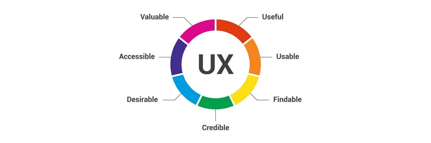
1. User-Centered Design
User-Centered Design is the foundation of UX design. It focuses on understanding the needs, behaviors, and pain points of the users. This principle ensures that the design process revolves around the user, making the product intuitive and accessible. Key aspects include:
- Conducting user research to gather insights about the target audience.
- Creating user personas to represent different user types.
- Iterative testing to refine the design based on user feedback.
2. Consistency
Consistency in UX design ensures that users can easily navigate and interact with a product. It involves maintaining uniformity in design elements, such as colors, fonts, and button styles, across all pages or screens. Benefits of consistency include:
- Reducing cognitive load by making the interface predictable.
- Enhancing usability by aligning with user expectations.
- Building trust through a cohesive brand experience.
3. Accessibility
Accessibility ensures that a product is usable by people of all abilities, including those with disabilities. This principle emphasizes inclusivity and compliance with standards like WCAG (Web Content Accessibility Guidelines). Key practices include:
- Providing alternative text for images and multimedia.
- Ensuring keyboard navigation for users who cannot use a mouse.
- Using sufficient color contrast for readability.
4. Usability
Usability focuses on making a product easy to use and efficient for its intended purpose. A usable design minimizes user effort and maximizes satisfaction. Key elements of usability include:
- Clear navigation to help users find information quickly.
- Simple and concise content to avoid confusion.
- Error prevention through intuitive design and helpful feedback.
5. Visual Hierarchy
Visual Hierarchy organizes design elements to guide users' attention and prioritize information. It uses size, color, contrast, and placement to create a logical flow. Benefits of visual hierarchy include:
- Highlighting key information to improve comprehension.
- Enhancing readability by structuring content effectively.
- Improving user engagement by directing focus to important actions.
6. Feedback and Responsiveness
Feedback and Responsiveness ensure that users receive immediate and clear responses to their actions. This principle helps users understand the system's status and builds confidence in their interactions. Key components include:
- Providing visual cues like loading indicators or success messages.
- Ensuring quick system responses to user inputs.
- Offering error messages that guide users toward solutions.
7. Simplicity
Simplicity in UX design focuses on eliminating unnecessary elements and reducing complexity. A simple design enhances user satisfaction and minimizes frustration. Key strategies include:
- Prioritizing essential features to avoid overwhelming users.
- Using familiar patterns to reduce the learning curve.
- Streamlining workflows to make tasks quicker and easier.
What is the basic principle of UI/UX?
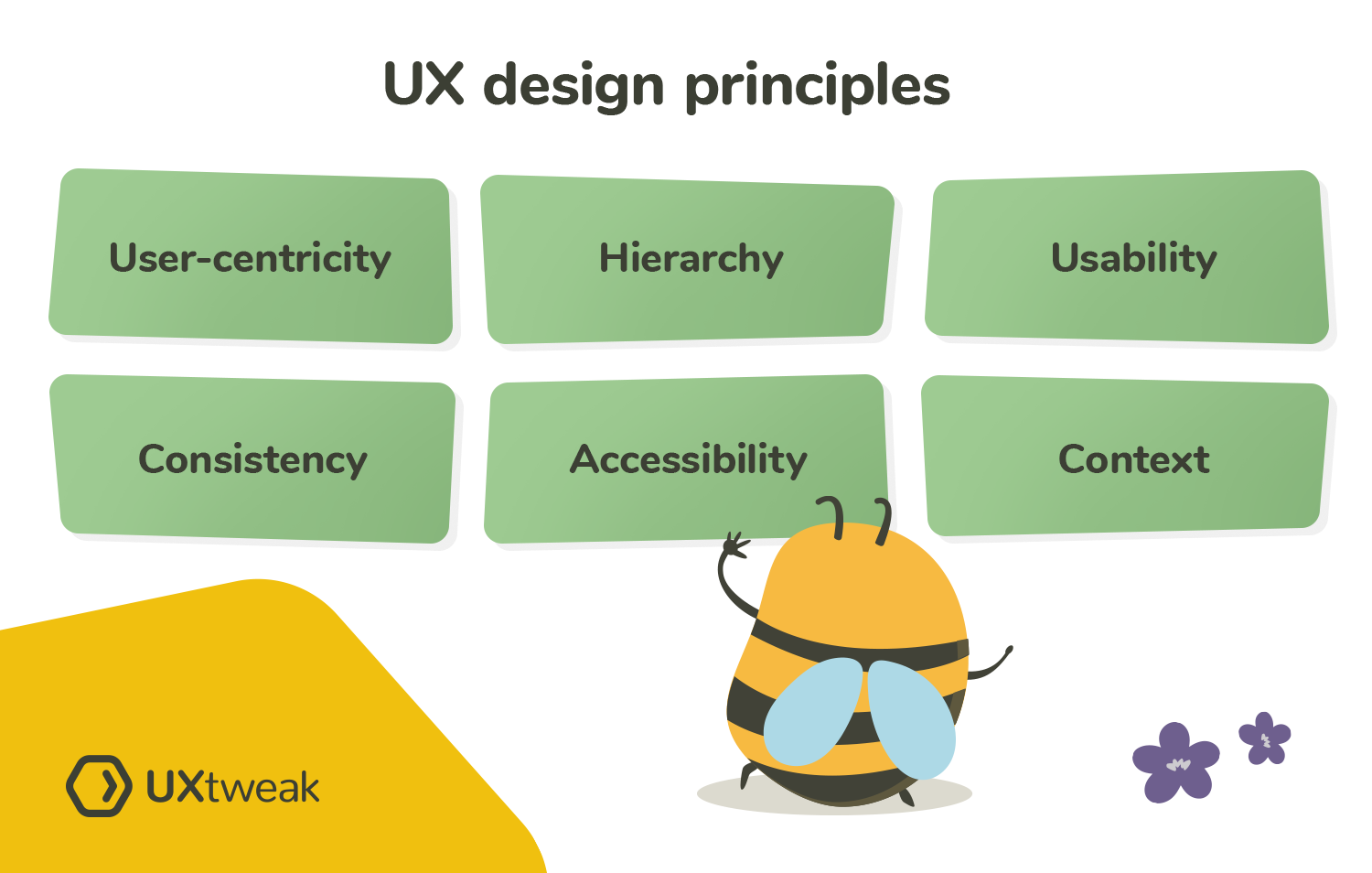
The basic principle of UI/UX (User Interface/User Experience) design is to create products that are user-centered, intuitive, and efficient. This involves understanding the needs, behaviors, and goals of users to design interfaces that are not only visually appealing but also functional and easy to navigate. The ultimate goal is to enhance user satisfaction by improving usability, accessibility, and interaction between the user and the product.
Understanding User Needs
To create effective UI/UX designs, it is crucial to understand the needs and expectations of the target audience. This involves conducting user research, gathering feedback, and analyzing user behavior. By understanding what users want and how they interact with a product, designers can create solutions that are tailored to their needs.
- Conduct user research to identify pain points and preferences.
- Analyze user behavior through tools like heatmaps and analytics.
- Create user personas to represent different user types and their goals.
Simplicity and Clarity
A key principle of UI/UX design is to keep the interface simple and clear. Overloading users with too much information or complex navigation can lead to frustration. Designers should focus on creating clean layouts, using straightforward language, and ensuring that users can easily find what they need.
- Minimize clutter by prioritizing essential elements.
- Use clear and concise labels for buttons and menus.
- Ensure consistent design patterns across the interface.
Consistency Across the Interface
Consistency is vital in UI/UX design to provide a seamless experience. This includes maintaining uniformity in colors, fonts, button styles, and navigation patterns. A consistent design helps users feel more comfortable and reduces the learning curve when interacting with a product.
- Use a unified color palette and typography throughout the design.
- Standardize interactive elements like buttons and links.
- Follow platform-specific guidelines (e.g., Material Design for Android).
Accessibility and Inclusivity
Designing for accessibility ensures that products are usable by people with diverse abilities, including those with disabilities. This involves adhering to accessibility standards, such as providing alternative text for images, ensuring sufficient color contrast, and enabling keyboard navigation.
- Follow WCAG guidelines to make designs accessible.
- Test designs with assistive technologies like screen readers.
- Ensure color contrast meets accessibility standards.
Feedback and Responsiveness
Providing feedback to users is essential for a positive experience. This includes visual cues, such as button animations, and system responses, like error messages or success notifications. Additionally, ensuring that the interface is responsive and works well across different devices is critical.
- Use animations and micro-interactions to guide users.
- Provide clear error messages and solutions when issues arise.
- Optimize designs for various screen sizes and devices.
What are the 5 visual design principles in UX UI?

1. Balance
Balance in UX/UI design refers to the distribution of visual elements to create a sense of stability and harmony. It ensures that no single part of the design overpowers the others, making the interface more intuitive and aesthetically pleasing. There are two main types of balance:
- Symmetrical Balance: Achieved by evenly distributing elements on either side of a central axis, creating a mirror-like effect.
- Asymmetrical Balance: Involves uneven distribution of elements, often using contrast in size, color, or shape to maintain visual equilibrium.
2. Contrast
Contrast is a fundamental principle that helps differentiate elements and guide user attention. It involves using opposing visual properties to make certain elements stand out. Key aspects of contrast include:
- Color Contrast: Using complementary or opposing colors to highlight important elements like buttons or text.
- Size Contrast: Varying the size of elements to create a visual hierarchy and emphasize key components.
- Shape Contrast: Utilizing different shapes to distinguish between interactive and non-interactive elements.
3. Alignment
Alignment ensures that elements are placed in a structured and organized manner, improving readability and usability. Proper alignment creates a clean and professional look. Key points include:
- Grid Systems: Using grids to align elements consistently across the interface.
- Edge Alignment: Aligning elements to the edges of a container or other elements for a cohesive layout.
- Center Alignment: Centering elements to create a focal point or balance within the design.
4. Repetition
Repetition involves using consistent visual elements throughout the design to create unity and reinforce branding. It helps users recognize patterns and navigate the interface more easily. Important aspects of repetition include:
- Consistent Typography: Using the same fonts and text styles across the interface.
- Color Schemes: Repeating specific colors to maintain a cohesive look and feel.
- Iconography: Using the same set of icons to represent similar actions or features.
5. Proximity
Proximity refers to the placement of related elements close to each other to indicate their relationship. This principle helps users understand the structure and organization of the interface. Key considerations include:
- Grouping Related Items: Placing similar elements, such as form fields or navigation links, together.
- Spacing: Using appropriate spacing to separate unrelated elements and avoid clutter.
- Visual Hierarchy: Arranging elements based on their importance to guide user attention effectively.
Frequently Asked Questions (FAQ)
What is the importance of user-centered design in SaaS applications?
User-centered design is a cornerstone of effective UI/UX design for SaaS applications. It focuses on understanding the needs, behaviors, and pain points of the end-users. By prioritizing the user experience, designers can create interfaces that are intuitive, efficient, and enjoyable to use. This approach ensures that the application aligns with user expectations, reduces the learning curve, and increases user satisfaction. Incorporating user feedback throughout the design process is essential to refine and improve the product continuously.
How does consistency improve the user experience in SaaS applications?
Consistency in UI/UX design ensures that users can easily navigate and interact with a SaaS application without confusion. This includes maintaining uniformity in visual elements like colors, typography, and icons, as well as functional consistency in interactions and workflows. Consistent design patterns help users build familiarity, reducing cognitive load and enhancing usability. For SaaS applications, which often have complex features, consistency is critical to creating a seamless experience across different modules and platforms.
Why is simplicity a key principle in SaaS UI/UX design?
Simplicity is vital in SaaS UI/UX design because it helps users focus on their tasks without unnecessary distractions. A cluttered or overly complex interface can overwhelm users and hinder productivity. By simplifying the design, emphasizing clear navigation, and minimizing unnecessary elements, designers can create a more efficient and enjoyable user experience. Simplicity also extends to the onboarding process, where intuitive design helps new users quickly understand and adopt the application.
How does accessibility impact the design of SaaS applications?
Accessibility ensures that SaaS applications are usable by everyone, including individuals with disabilities. This principle involves designing interfaces that accommodate various needs, such as screen reader compatibility, keyboard navigation, and sufficient color contrast. By prioritizing accessibility, SaaS applications can reach a broader audience and comply with legal standards like the Web Content Accessibility Guidelines (WCAG). Additionally, accessible design often improves the overall user experience for all users, making it a critical aspect of UI/UX design.
Deja una respuesta
Entradas Relacionadas